Animation Studio & Narrative Fiction
DARING ANIMATION
Visual Identity & System Guidelines
The Challenge
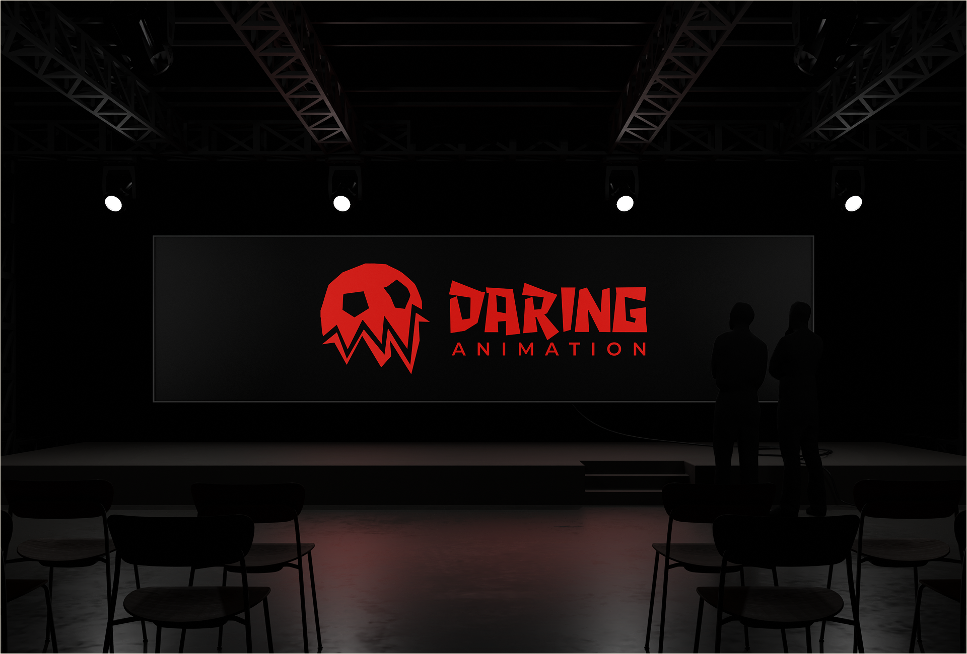
Daring Animation specializes in creating cinematic narrative works, dedicated to developing deeply empathetic characters within rich fictional worlds. The studio needed a visual identity that radiated edge, audacity, and uncompromising artistic direction, distancing itself from typical corporate aesthetics.
The Execution
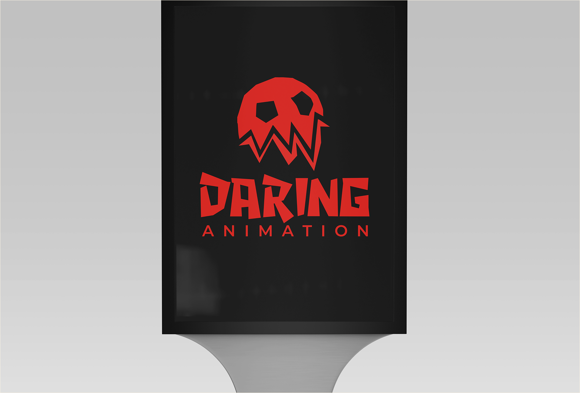
The visual language rejects rounded geometry, deliberately avoiding soft edges in favor of sharp, aggressive cuts. This uncompromising structure establishes a commanding presence tailored for modern entertainment and cinematic storytelling.
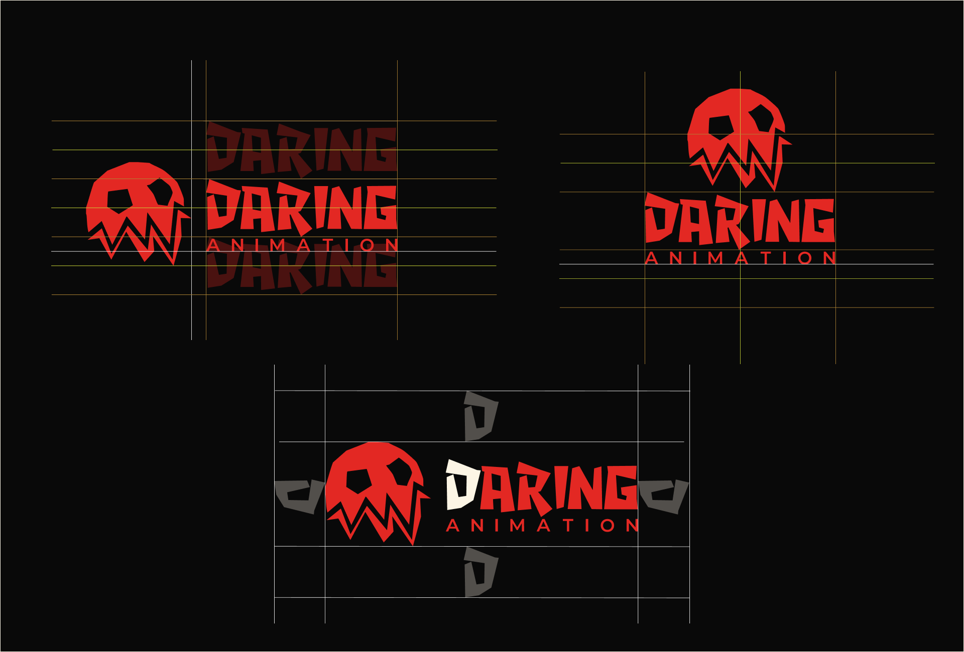
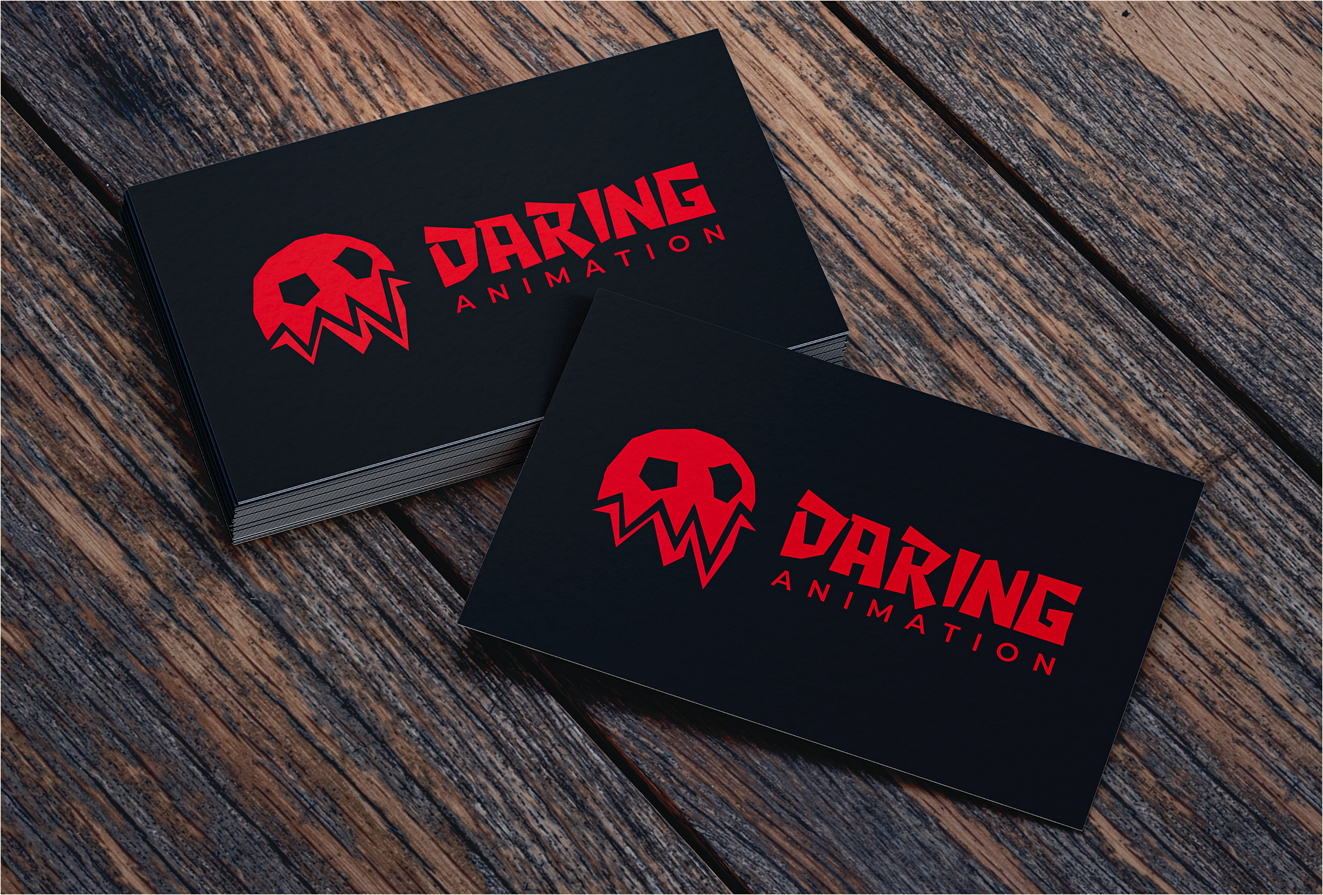
At the core of the brand sits Spike, the skull mascot. Featuring an animalistic lower jaw inherited from the parent brand Daring, Spike personifies fearlessness, rebellion, and dynamic narrative tension.
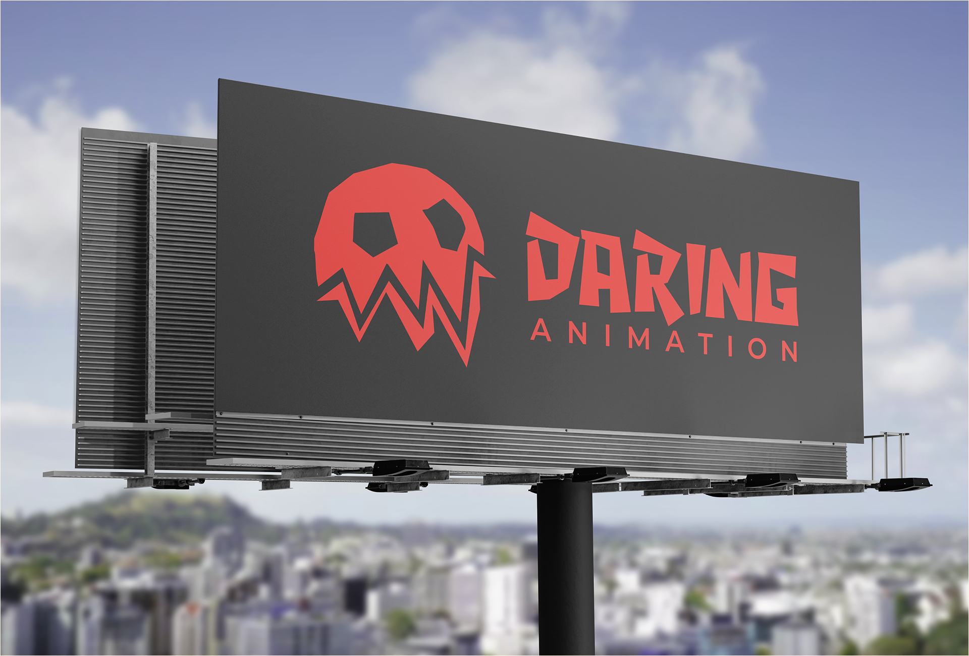
The mark is calibrated within an exacting construction grid and exclusion area, ensuring absolute visual integrity and proportional stability across both micro-scale digital assets and massive environmental signage.
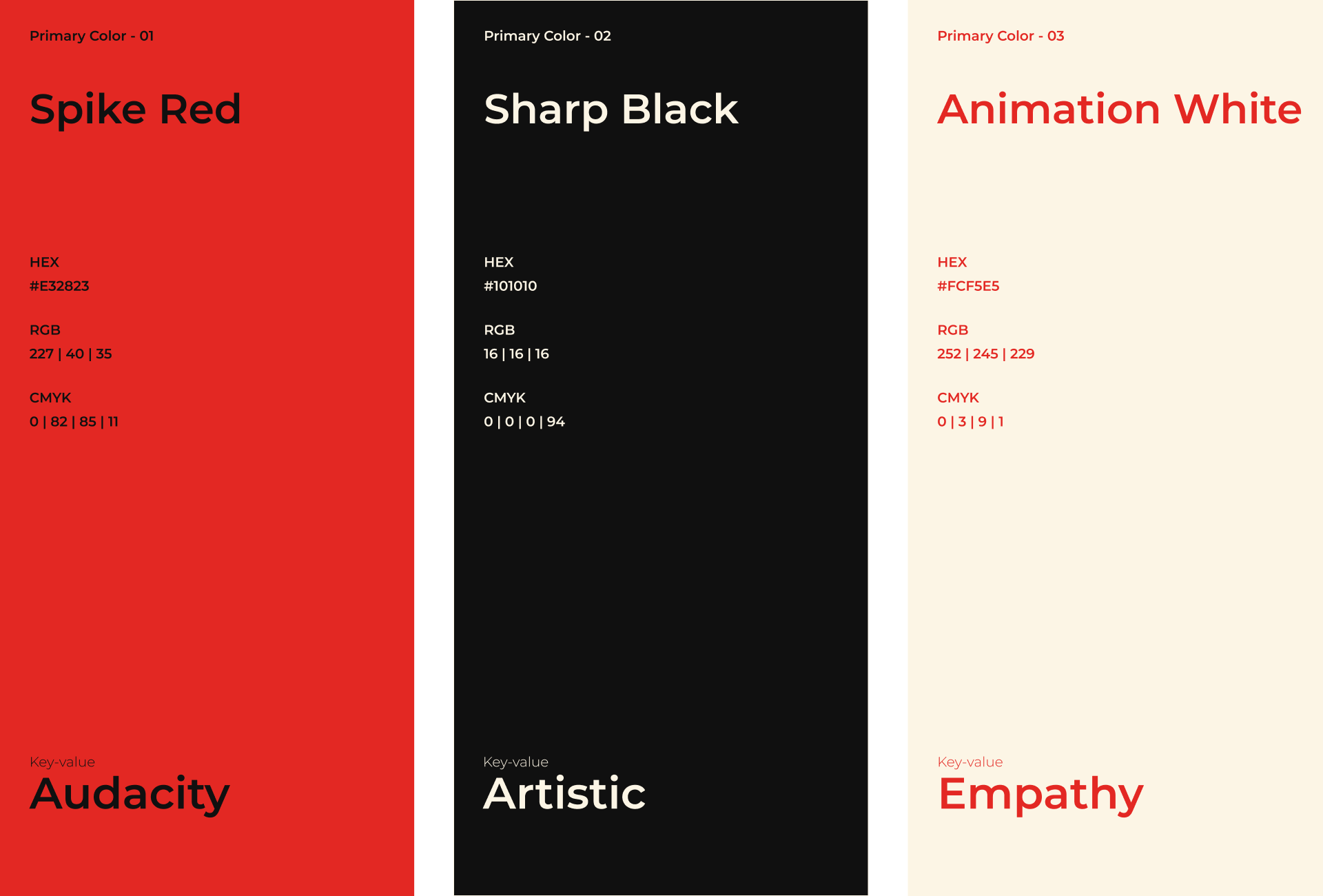
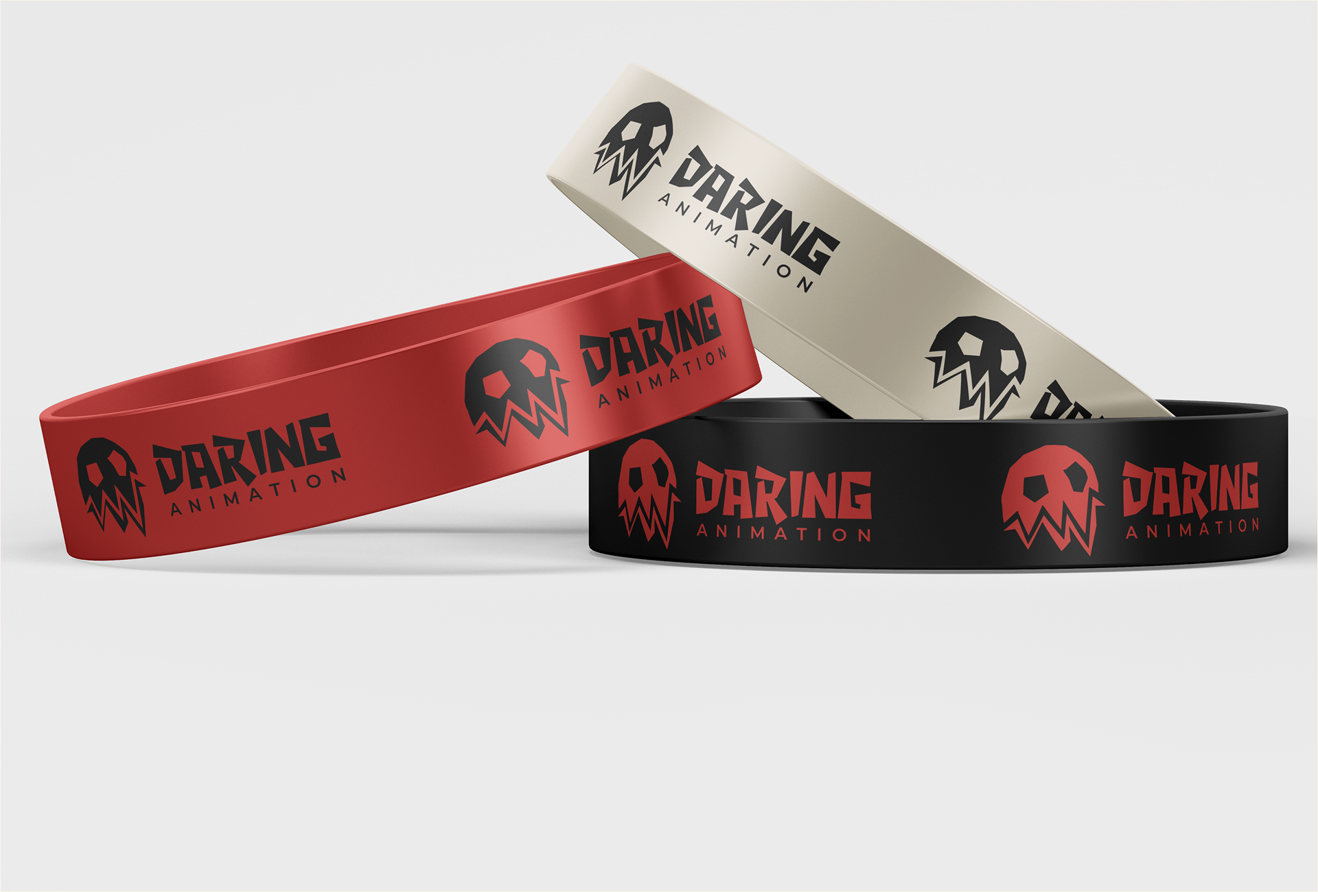
The color strategy balances three core pillars: Spike Red (#E51E2B) for high-impact audacity, Sharp Black (#0A0A0A) for theatrical depth, and Animation White (#FFFFFF) for crisp editorial contrast.
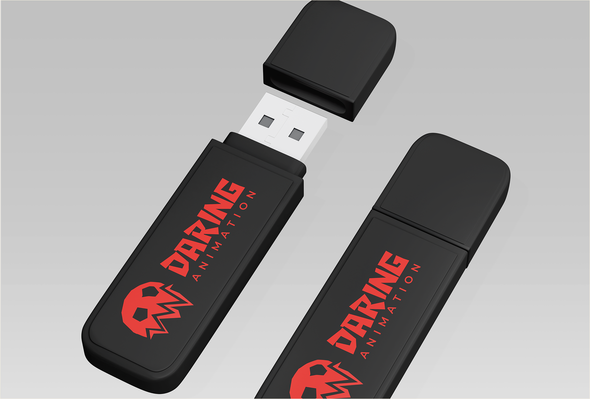
The typographic pairing creates a clear dialogue: a custom bold display typeface drives hero titles and logotypes with futuristic cadence, while the versatile Montserrat family governs corporate literature, UI text, and official studio documentation.
Is your studio's branding holding you back?
From visual identity systems to aggressive marketing collateral, let's build a brand that demands attention.
Book a Discovery Call