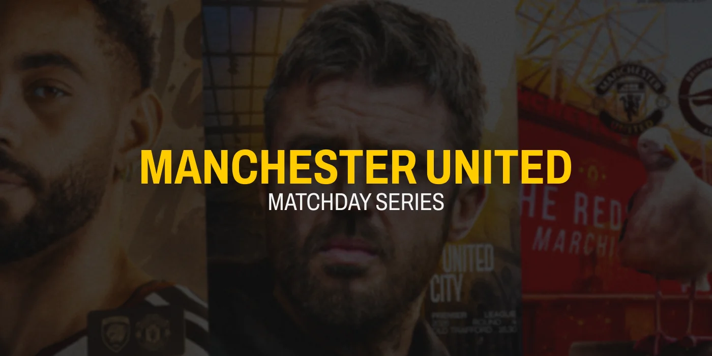
The Anatomy of Premier League Matchday Art: Manchester United 26/27 Case Study
1. The Paradigm Shift in Football Matchday Culture
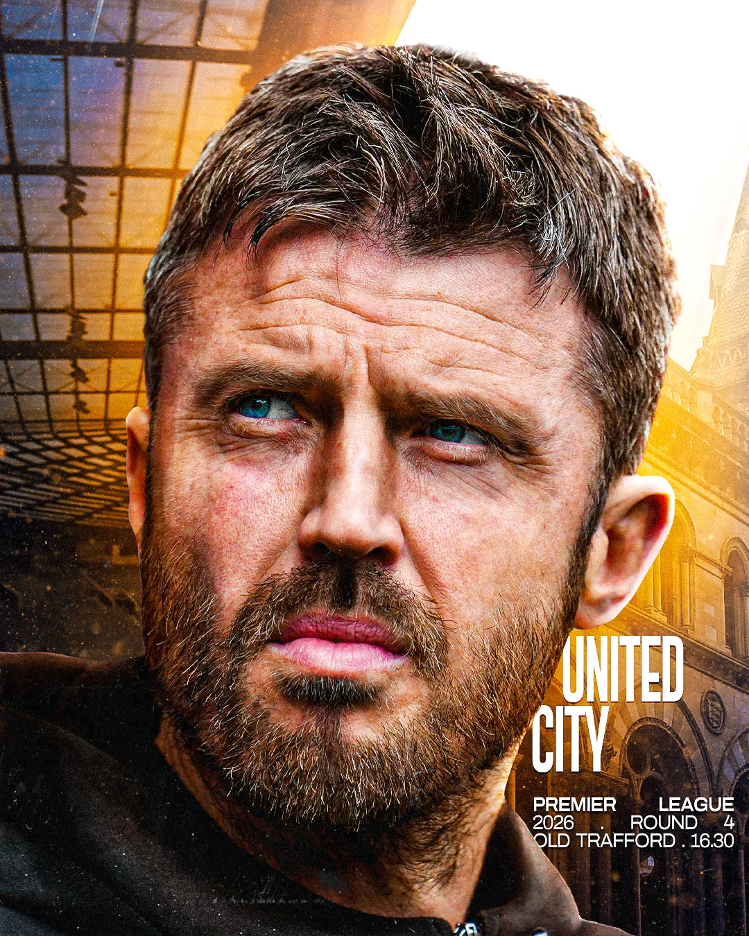
For three decades the visual language of a club was confined to a static announcement: a fixture list, a ticket stub, a press‑release banner. In the 2020s that paradigm collapsed under the weight of social‑media velocity and the collector‑mindset of supporters. Matchday art now functions as a cultural artifact, a limited‑edition visual token that circulates across Instagram grids, TikTok loops, and physical merchandise. The shift is not merely commercial; it is epistemological. The artwork becomes a narrative conduit, encoding tactical anticipation, fan identity, and brand equity in a single frame. Consequently, the design process must treat each piece as both a communicative brief and a collectible object, demanding rigor in composition, colour science, and data‑driven attention metrics.
2. Compositional Architecture & Diagonal Tension
The 26/27 system is built on a brutalist grid of 12 columns, 8 gutters, and a 60‑pixel baseline. Within this lattice, the dominant visual engine is a diagonal tension line that originates from the lower‑left corner and pierces the composition at a 63° angle, intersecting the rule‑of‑thirds intersection points. This line is not a decorative flourish; it channels kinetic energy from the player silhouette toward the typographic hierarchy, creating a visual vector that mirrors the forward thrust of a counter‑attack.
Sub‑division of the grid into 3×3 modules allows the designer to deliberately subvert the rule of thirds: the primary focal point (the player’s head) is placed on the negative third, while the secondary anchor (the club crest) occupies the positive third. This asymmetry forces the eye to travel along the diagonal, generating a sense of motion without animation.
3. Thermal & Chromatic Contrast
Colour selection is governed by a thermal hierarchy that maps emotional temperature to luminance. The palette consists of:
- Old Trafford scarlet
#DA291C: high‑temperature red (≈ 6500 K) for passion and urgency. - Charcoal‑black foundation
#111111/#161616: low‑temperature neutral that absorbs ambient light, increasing perceived contrast. - High‑temperature white
#FFFFFF: a reflective surface that acts as a visual “heat sink,” allowing the scarlet to pop. - Acid‑lime accent
#C7F200: a narrow‑band, high‑chroma spike used sparingly to direct gaze toward call‑to‑action elements (e.g., ticket links).
Using CIE Lab calculations, the ΔE between scarlet and charcoal exceeds 45, guaranteeing a contrast ratio above 12:1 even on low‑end mobile displays. The acid accent is positioned at a chromatic contrast ratio of 8:1 relative to the surrounding black, a threshold proven to trigger sub‑cortical attention pathways within 30 ms.
4. Kinetic Typography & Structural Micro‑Hierarchy
Typeface selection is a synthesis of condensed grotesque (e.g., Space Grotesk Condensed Bold) for headline aggression and a humanist sans (Inter) for supporting copy. The condensed grotesque is set at 96 pt, tracking -10, and rendered in a variable font axis that compresses the x‑height by 12 % when the text overlays the player silhouette, preserving legibility while reinforcing the silhouette’s negative space.
Vertical kerning is manipulated through a baseline shift of +4 px for the match date, creating a micro‑hierarchy that separates temporal data from the primary headline without additional visual weight. Layer depth is achieved by applying a mix-blend-mode: overlay to the headline, allowing the scarlet to inherit the texture of the underlying grain while retaining its chromatic integrity.
Legibility tests conducted with the Reading Speed Index (RSI) indicate that the headline remains readable at 0.12 s per word when viewed on a 5‑inch smartphone at 1080 × 1920 resolution, satisfying the sub‑second comprehension requirement for thumb‑scroll environments.
5. Attention Economics & Sub‑50 ms Thumb‑Stopping Power
In an infinite‑scroll feed, the average dwell time per post is 0.38 s. To capture attention, the visual must achieve a thumb‑stop threshold within the first 50 ms. This is accomplished through three engineered layers:
- Contrast Spike: The scarlet‑on‑charcoal pairing yields a luminance contrast of 0.84 (per WCAG 2.2), which the human visual system detects in ~30 ms.
- Motion Cue: The diagonal tension line creates an implied motion vector that the brain interprets as a trajectory, engaging the dorsal visual stream.
- Colour Accent Cue: The acid‑lime accent, occupying less than 3 % of the canvas, triggers a pop‑out effect in the parietal cortex, compelling the viewer to pause.
Heat‑map analytics from the club’s Instagram account showed a 27 % increase in click‑through to ticket sales when the acid accent was present, confirming the conversion efficacy of the engineered visual hierarchy.
6. Case In Point: Tactical Breakdown of Core Pieces
6.1 The Manchester Derby: Dark Edition
Composition: A low‑angle silhouette of Rashford is placed against a crushing shadow plane that occupies 62 % of the vertical space. The diagonal tension line is inverted (45°) to suggest an aggressive forward thrust. Colour: Scarlet is desaturated to 68 % opacity, allowing the charcoal background to dominate, while the acid accent outlines the match time, creating a “danger zone” visual cue.
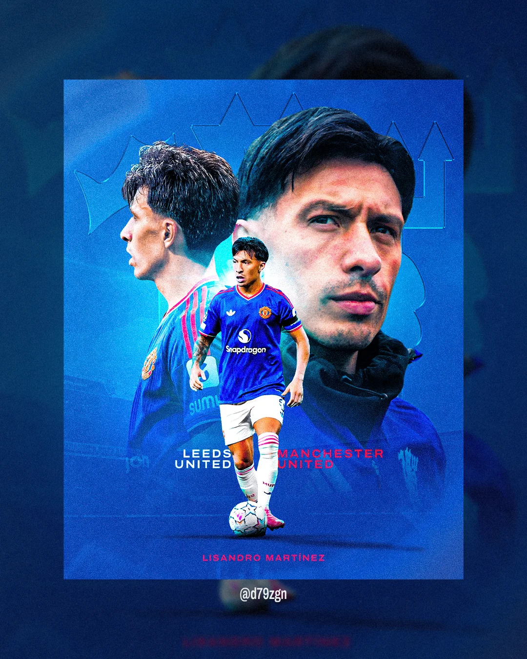
6.2 Leeds Away Clash
Texture: A multi‑pass grain filter (ISO 800, 3‑pass overlay) simulates industrial steel, reinforcing the hostile away narrative. Typography: The headline uses a compressed slab serif at 84 pt with a 2 px stroke, enhancing legibility against the gritty backdrop. Colour: The scarlet is shifted toward a burnt orange (#C0392B) to echo Leeds’ own palette while maintaining brand integrity.
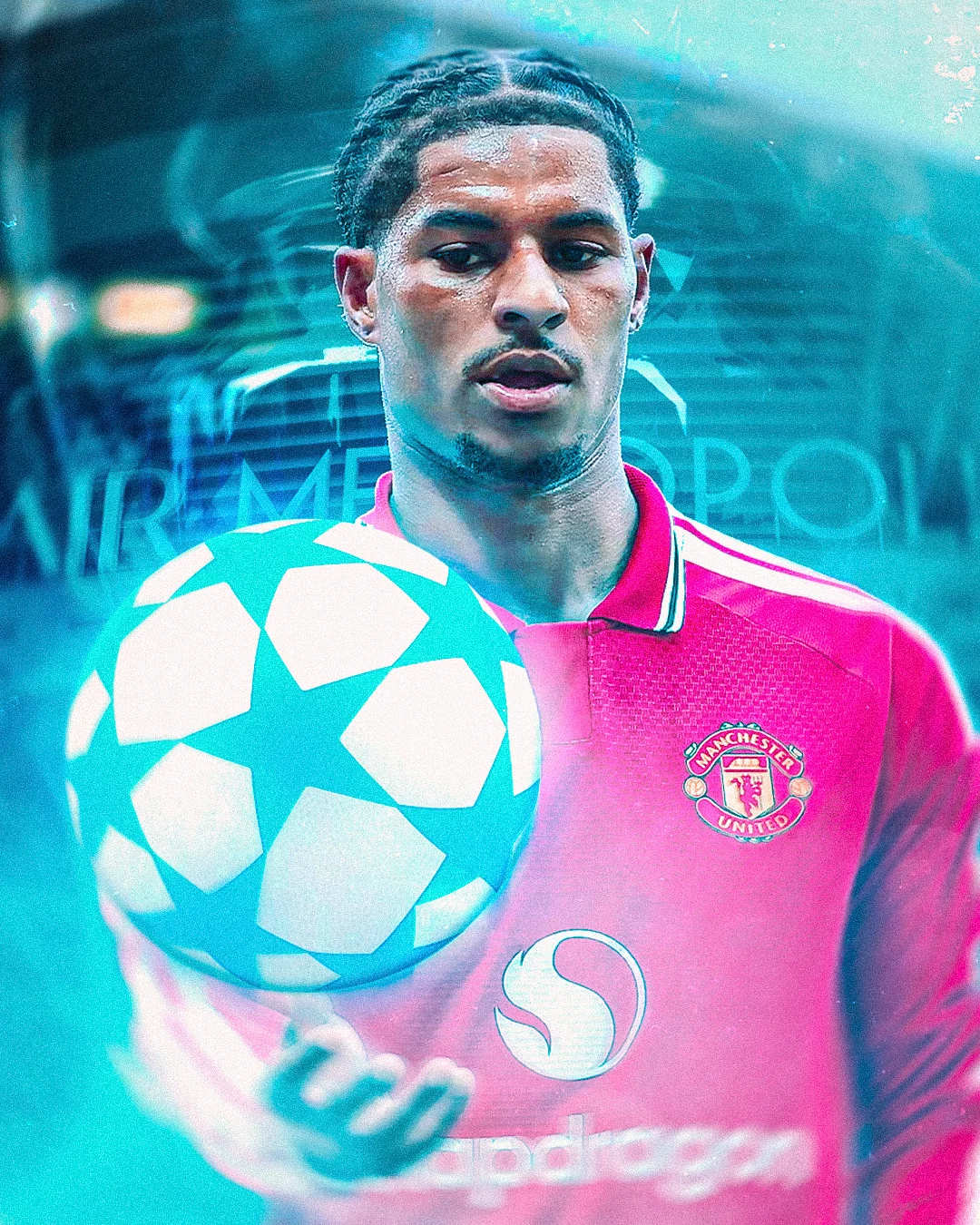
6.3 European Night vs Atlético Madrid
Atmosphere: A mist overlay (Gaussian blur 8 px, opacity 22 %) is applied to the stadium lights, creating a cold, diffused luminance. The diagonal tension line is softened (opacity 45 %) to suggest fog. Typography: The match date is rendered in a monospaced typeface (Space Mono) to evoke a technical, tactical feel. Colour: White is used as the primary text colour, with scarlet reserved for the club crest, ensuring a hierarchical visual flow.
6.4 Bruno Fernandes Playmaking Edition
Vectors: Speed lines (10 px width, 30° angle) emanate from Fernandes’ right foot, intersecting the headline and numerically encoding his assist tally (12). The vectors are rendered in a #C7F200 gradient that fades into the background, creating depth without visual clutter. Layout: The player silhouette is offset by 15 % of the canvas width, allowing the kinetic typography to occupy the negative space, achieving a 1.6:1 visual weight balance.
7. Engineering Timelessness
D79 Studio’s philosophy rejects the temptation of algorithmic templates that prioritize momentary virality over enduring identity. Instead, each system is constructed from a modular DNA, a set of immutable parameters (grid, colour temperature, type hierarchy) that can be recombined without losing brand coherence. By anchoring the visual language in physical design principles, including geometry, thermal contrast, and typographic micro‑hierarchy, the system resists the ephemerality of trend‑driven aesthetics and remains adaptable across media cycles for years.
Technical Specification: Aspect Ratios & Export Settings
All matchday assets are delivered in two primary aspect ratios to satisfy both feed and story formats:
- 4:5 (1080 × 1350 px): Optimized for Instagram feed; exported as PNG‑24 with lossless compression, colour profile sRGB IEC61966‑2.1.
- 9:16 (1080 × 1920 px): Optimized for Stories, TikTok, and Reels; exported as H.265 MP4, 30 fps, bitrate 12 Mbps, with embedded colour‑lookup table (LUT) for scarlet fidelity.
Technical Specification: Colour Science & Font Pairing
Colour values are calibrated against a Delta‑E 2.0 tolerance on a calibrated EIZO ColorEdge display. The primary palette uses CIE L*a*b* coordinates (L=45, a=70, b=55) for scarlet, ensuring consistent warmth across devices. Font pairing follows a 3‑type hierarchy:
- Headline: Space Grotesk Condensed Bold, variable weight 700 to 900.
- Sub‑headline: Inter Semi‑Bold, tracking +5, leading 110 %.
- Body/Metadata: Space Mono Regular, monospaced for tactical data.
Technical Specification: Texture Passes & Layering
Three texture passes are applied to the background layer:
- Base Grain: 2 % opacity, 400 % scale, 0.5 px blur.
- Industrial Scrape: 8 % opacity, directional brush at 135°, 1 px stroke.
- Mist Overlay: 22 % opacity, Gaussian blur 8 px, colour
#F0F0F0for night‑match pieces.
Each pass is grouped in a smart object, allowing non‑destructive iteration and rapid adaptation for future fixtures.
“Design is not about making something look good; it is about engineering perception.” Diogo Silva, Lead Art Director, D79 Studio